Sunday, November 3, 2013

Google Leaks Another 8-inch Tablet, Nexus 8

Google Leaks Another 8-inch Tablet, Nexus 8?

Look what we have here. It seems that Google is not good at all in keeping secrets. All the recent devices were leaked extensively starting with the Nexus 7, and more recently, the Nexus 5 that was leaked in the Android 4.4 Promo video with a bunch of leaks afterwards. Now, the search engine giant leaked yet another upcoming tablet, an 8-inch Nexus tablet.
Nexus 8
 The image appeared on the Android website under the apps and entertainment page that lists a few applications and features of Android. The image shows a woman using a Google Nexus tablet that is a little bigger than Nexus 7 and not too big to be called a Nexus 10. So, we’re wildly guessing that it should be around 8-inches or maybe called a Nexus 8.
We don’t know how much truth lies in this image, but it looks like an 8-inch tablet. It seems we might see an iPad Mini competitor very soon. The application looks quite different and carry thinner bezels than the current Nexus 7. Additionally, it appears that the tablet is running Android 4.4 KitKat, thanks to the white icons in the status bar.
Well, now the rumor mill has a new product to talk about, and if the image is really a Nexus 8, we will see a handful of leaks in the coming weeks.
Source: The Verge

Android's SmartWatch will be Android compatible; coming this December

Android's SmartWatch will be Android compatible; coming this December


Android smart watch

Fashion watch company Android is getting into the wearables game with their own smart watch design

Android as a brand is used for more than just smartphones. One case where this is true is a small company that designs and sells moderately priced watches that feature bold, industrial design. They've been around a while, and have a considerable number of fans among "watch geeks" — including yours truly. 
I've been waiting for some company like Android to build a smart watch compatible with our Android phones since I first saw the Pebble. It looks like that's going to be soon, as the Android SmartWatch is said to be coming in December. The quick first look we see in the above image, and in the video after the break, aren't exactly the awe-inspiring design I was waiting for, but hopefully the price will be right and the functionality will be at least equal to the better units we see today. 
We'll know more when they tell us more, In the meantime, there's a video after the break that shows it off a bit, including the Galaxy S4 it's being used with. 
Source: Android Watches

Sony SmartWatch2 review


Sony’s third try at a smart watch hits almost all the bases

Sony is no stranger to the concept of smart wearables. We’ve seen the Sony Ericsson LiveView (which is best forgotten by everyone) and the original SmartWatch introduced at CES in early 2012, which was a little bit better but suffered from connectivity issues. Their latest version, aptly (yet unimaginatively) dubbed the SmartWatch 2 has a history to build on, and to try and not repeat.
Wearables are going to be a lucrative business for the right people. We all saw how the Pebble ripped through its Kickstarter goals, so the desire is out there. It will take a company that can get the form and the function just right to steal it all. Could Sony have done it with the SmartWatch 2? Sales say no, but we all know that best selling doesn’t mean best. Hit the break, have a read, and see what you decide.

The Style

If any wearable device isn’t comfortable, and doesn’t look good to the wearer, it is destined to fail.
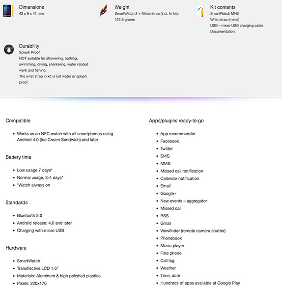
Sony hits the comfort mark very well here. The watch isn’t small by any means, checking in at 42mm square and 9mm thick, but it is very light and fits well. Anyone who has used a recent Xperia phone will recognize the design language here, flat front and back, graceful round corners and 90-degree angles where the sides meet. Crafted out of aluminum, the whole package feels rather nice, even if it’s too large for your tastes. On the other hand, if you’re used to 50mm and larger sport or designer watches, you won’t even notice this one on your wrist.
The band itself is a plain Jane silicone strap in black. It complements the look and feel of the watch, and while not the most stylish option, silicone watch straps are very easy to wear. Because it uses standard 24mm attachment lugs, you can easily change things up with any strap or bracelet that’s the right size. Aquick search of Amazon, or even your local big box store will turn up literally hundreds of options. For the review, I stuck with the supplied black silicone strap with its aluminum standard buckle. It’s not quite my style, but it looks good with the simple industrial design of the watch itself — at least to me it does.
And this is where things get a little less clear. How the SW2 looks on your wrist is something I can’t answer. Style and looks are very personal, and everyone has different tastes. It’s square, unassuming, and comfortable. Once we get past that, it’s all opinion. 
can give you mine, though. I still wear a watch on occasion, and some silly part of my brain makes me collect them. I’ve a few favorites, both expensive and not-so-expensive. None of them resemble the SW2. I don't favor square designs on my wrist, and given the choice I would prefer something similar to the cheap (the same price as the SW2, to be fair), but pretty watch you see above. Unfortunately, that design doesn't translate well into a touch screen device you wear on your wrist, so there’s a tradeoff to be made if you want the convenience of a wearable device, or just get a kick out of the cool factor. I’m willing to make it most of the time. Notifications of the things I feel are important are worth it. You have to decide if you feel the same.
Tag Heuer, please make a smart watch in 2014.

Specifications and hardware

  • Compatibility: Works with Android smartphones running Android 4.0 or later
  • Battery life: Up to seven days of light use, three to four days of heavy use (times calculated with watch always on)
  • Bluetooth 3.0
  • Charging via microUSB
  • Water resistant IP57
  • 1.6-inch Transflective LCD at 220x176 pixels
In real world use I get about three days from one charge. Normally, I’m synchronized to my Moto X, and send SMS messages, Hangouts messages, Google+ notifications and calls to the SW2. Hangouts really give things a workout, as it’s our de-facto form of communication here at AC and hundreds and hundreds of messages are coming in every day. I also engage as much as i can on Google+, so it’s buzzing quite a bit, too. Now that the review is over I’ll scale back and remove the Google+ notifications, which is simple enough to do via an app on my phone. It was just a good way to test.
The screen is fair. The Transflective design (it uses ambient light to adjust contrast and reflects it back) is plenty visible, even in bright light, and in the dark a tap of the crown will fire up the backlight. The resolution is a little low, but I’m not watching movies on this tiny screen so I call it passable. The touch function has performed well, and things are responsive as expected. In fact, there's really no niggle over the hardware I can find to write about. It's solidly built, and everything it was advertised to do, it does well.
This SW2 has taken quite a beating, and taken it well. I’m that type of guy who is sure he can fix his own toilet, or lawnmower, or chest freezer or anything else and not have to spend money. Of course in the end I spend more because I’ve made things worse, but I like to tinker with things. I’ve beat and banged this unit around, and it’s no worse for wear. We know that the SW2 is IP57 dust and water resistant, but the design and construction also do a good job keeping it free from damage.
The one thing I have to mention that's not positive isn't about the watch itself, it's about the software on your phone. The software is clear, easy to understand and does what it intends to do, but it can be a little buggy. On more than one occasion it has locked itself awake — sometimes thinking I've put the phone in a Sony smart dock accessory — ramped the processor up, and drained the battery down to the warning beep in under an hour. It did this before the recent update, and it still does it. For the curious, I tested with my Moto X (Android 4.2.2) and with the Nexus 4 (Android 4.3). I see this issue on both phones.

Function

Apps
Enough about how it looks and how it works. Let’s talk about what it can do. There’s an operating system installed on the SW2, presumably Android, but just about everything is done via your smartphone. Using the Sony Smart Connect application, you can install “modules” for things like Sony smart docks, chargers and of course the SW2. It’s through this portal that you’ll install and set things up on your phone.
quick look in Google Play will show you that there are a couple hundred apps compatible with the SW2. Ranging from things like call and message handlers to a Snake clone (remember those BREW games?), some work very nicely while others will be quickly uninstalled. it’s the same as Google Play in general, and we can’t expect every app to be a gem.
Sony themselves offer some in-house apps for the SW2, and they all work well enough. You’ll find apps for Gmail, standard POP3 email, Twitter, messaging and more, and most of what you need will be covered. Being “mostly” good is never good enough, so there are also apps that will intercept any notification (yes, I can make my watch tell me that I updated Chrome in Google Play) and forward them to your wrist. Some are free, some aren’t. I tried them all, and have to give Watch Notifier ($1.79 in Google Play) the nod. I normally would never drop an app recommendation in a review, but for me, this app is what makes the SW2 worth using. Without it, some notifications are missing, and I found it to be the most consistent of all the apps I tried.
One noticeable omission is user-installed watch faces. A selection of five are included — four analog in both black or white, and with and without a date window, and one digital. Other watch face apps you’ll find in Google play are really more like widgets, and are displayed only when open and running on the watch. It seems developers are not given access to the default screen, which is a shame.
Navigation of the UI is simple, and familiar to most anyone with an Android. Tap the home button to zip away from the watch screen and get to your installed apps, pull the notification shade down to check missed notifications, and use the three-dot menu key anytime you’re in an app and think you should see more. There’s nothing groundbreaking here, nor should there be — this is an accessory, and one where simplicity is key. Sony is on the right track here, mimicking the Android UI but keeping it simple. They just need a bit more refinement and polish of the interface to make it look less clunky. 

The verdict

As a watch junkie of sorts, I seem to be collecting the "popular" models. That’s currently a short list, but we certainly expect it to grow. Without taking any other model into consideration, I think the SW2 is priced a bit too high to recommend. Currently $200 at Amazon, the price is a bit too steep for what it can do — the same as all the current smart watches. The tech just isn't there yet, at least not at $200. Maybe Kit Kat and Google's rumored watch can fix this.
If you’re not afraid to spend a little more than you should — and I’m certainly guilty often enough — and are in the market for a smart watch, I would still have to recommend the Pebble. It may not look as nice, and it’s not water "dust-resistant", but it’s developer-friendly, gets better battery life, and does the basics as good as the SW2 for a few dollars less.
If you’re a fan of the SW2, and I know there are plenty out there, you’re probably preparing to tell me what I didn’t consider or what I forgot. Likely, I’m guilty of both on some level, but to me, until someone gets it right, the SW2 doesn’t offer enough to recommend, and the cheapest alternative is the best alternative until we see a smart watch that hits all the bases.

The Nexus 5 Difference

Did anyone else know there were two different Nexus 5 models available for purchase? There’s a North America model, D820, and a D821 model that’s pretty much meant for the rest of the world.
The D821 model may be a number higher, but the two phones are pretty much the same. The difference lies in the mobile network bands each model is compatible for. Essentially, the North America model can make use of the network bands used by the major companies in North America, and the D821 is optimized for Europe and the rest of the world
Nexus 5 KitKat
Nexus 5 is here
Here’s a list to put the differences into perspective and make it easier for you to figure out which one is right for you:
North America (D820)
-          GSM: 850/900/1800/1900 MHz
-          CDMA: Band Class: 0/1/10
-          WCDMA: Bands: 1/2/4/5/6/8/19
-          LTE: Bands: 1/2/4/5/17/19/25/26/41
Rest of World (D821)
-          GSM: 850/900/1800/1900 MHz
-          WCDMA: Bands: 1/2/4/5/6/8
-          LTE: Bands: 1/3/5/7/8/20
Either phone should work no matter where you are, but there is the chance of running into some issues if you buy the wrong model. To make it easy on yourself, buy the D820 if you live in North America or the D821 if you live anywhere else.
Now we obviously can't give a perfect list of every network in the world that each phone will work on, but at least in the U.S. the list is a bit shorter. Out of the box the D820 model will work just fine for 2G, 3G and LTE data on T-Mobile, AT&T and Sprint. Any MVNO that operates on the T-Mobile or AT&T network will be good to go as well, but things turn into a bit of a grey area once you go beyond there.
Outside of North America, the Rest of World D821 model should have no issues connecting to 2G, 3G and LTE throughout Europe and beyond. Things again get into a grey area when you head over to Asia where different and unique networks are run. What you see above is just a spec sheet — be sure to double, triple and quadruple check the bands your carrier of choice runs on before you make a purchase.
We aren't exactly to the utopian world of a single phone to work throughout the entire world, but this is pretty darn close

Saturday, August 24, 2013

Xolo Q1000S with 5-inch HD display

Xolo Q1000S with 5-inch HD display, 1.5 GHz quad-core processor, 13MP camera launched for Rs. 18999


Xolo Q1000S
Xolo has launched the Q1000S, the company’s latest flagship smartphone in the Q Core series. Wereported about the device back in July and Xolo started teasing about the device on their Facebook page earlier this week. It has  a 5-inch (1280 x 720 pixels) HD IPS display at 295 PPI based on one-glass solution (OGS) technology and runs on Android 4.2 (Jelly Bean) similar to the Q1000 that was launched back in May. It is powered by a 1.5 GHz quad-core MediaTek 6589T processor with PowerVR SGX544 GPU .
Xolo Q1000S
It comes with a 13-megapixel auto focus camera at the back with LED Flash and a BSI (Back Side Illumination) 2 sensor for low-light imaging and a 5-megapixel front-facing camera with a BSI 2 sensor. It comes with dual SIM support with dual standby similar to other Xolo smartphones.It has 16GB of internal memory, packs a 2500 mAh battery and is just 6.98mm thick.
Xolo Q1000S Specifications
  • 5-inch (1280 x 720 pixels) HD IPS display at 295 PPI
  • 1.5 GHz quad-core MediaTek 6589T processor with PowerVR SGX544 GPU
  • Android 4.2 (Jelly Bean)
  • Dual SIM (GSM + GSM)
  • 13MP rear camera with LED Flash, BSI 2sensor
  • 5MP front-facing camera , BSI 2sensor
  • 6.98 mm thick and weighs 158g
  • 3.5mm audio jack
  • Full HD 1080p video recording and playback
  • 1GB RAM, 16GB internal memory
  • 3G (HSDPA: 42.2 Mbps, HSUPA:  11.5 Mbps), WiFi 802.11 b/g/n, Bluetooth 4.0, GPS
  • 2500 mAh battery
The Xolo Q1000S is priced at Rs. 18,999.

Thursday, August 22, 2013

Micromax Canvas Doodle 2 A240

Micromax Canvas Doodle 2 A240 with 5.7-inch HD display, Android 4.2 listed online


Micromax Canvas Doodle 2 A240
Micromax has been teasing the upcoming Canvas Doodle 2 A240 on their Facebook page for the past few days, now the smartphone has been listed on Flipkart. The Micromax Canvas Doodle 2 A240 would have a 5.7-inch (1280 x 720 pixels) HD IPS display, powered by a 1.2 GHz quad-core processor and run on Android 4.2 (Jelly Bean). It would come with a 12-megapixel camera with dual LED flash and a 5-megapixel front-facing camera. It would have with Dual SIM support with dual standby similar to other Micromax smartphones. It also comes with a stylus and pack a 2600 mAh battery.
Micromax Canvas Doodle 2 A240
No details about the RAM yet, but it is likely to come with 1GB of RAM similar to the Canvas 4. It would come with Blow to unlock feature, unique M! Doodle app. Micromax launched the Canvas Doodle A111with a 5.3-inch FWVGA display and a quad-core Snapdragon 200 processor back in May.
Micromax Canvas 4 A210 specifications
  • 5.7-inch (1280 x 720 pixels) HD capacitive touch screen IPS display
  • 1.2 GHz quad-core processor
  • Dual SIM (GSM + GSM)
  • Android 4.2 (Jelly Bean)
  • 12MP rear camera with Dual LED Flash
  • 5MP front-facing camera
  • 3.5mm audio jack
  • 12GB internal memory, expandable memory upto  32GB with MicroSD
  • 3G, WiFi 802.11 b/g/n, Bluetooth, GPS/A-GPS
  • 2600 mAh battery
No word on pricing yet since the listing says coming soon without any price tag, but it is likely to be priced similar to the Canvas 4.

Thursday, August 1, 2013

Hands on: New Nexus 7 review

Hands on: New Nexus 7 review

While everyone waited on an iPad mini 2 with retina, Google and Asus went ahead and did one better. Presenting the new Nexus 7, an affordable 7-inch tablet with beefy specs and more pixels per inch than you can shake a 1080p jpeg at.
Whether you call it the Nexus 7 2 or just the Nexus 7, it hurdles right over the iPad mini in both parts and price. For just a little more money, it offers a lot more functionality than a Kindle Fire HD. It so surpasses the original Nexus 7 that Google has swept last year's tablet under the rug; it seems to be retired from the Play Store altogether.
New Nexus 7 review
Internally, the new Nexus 7 packs a 1.5Ghz quad core processor, 2GB of RAM and comes with either 16GB or 32GB of storage. Those models go for $229/£200 and $269/£240, and there's also an LTE version selling for $300, but its fate in European markets seems unclear, and we've yet to get word on Australian pricing.
While microSD slots now feel like a relic of a bygone era, since neither Nexus nor Apple devices offer them, we have to bemoan storage space a bit here. The Android 4.3: Jelly Bean OS found on the Nexus 7 takes up a whopping 6GB. Our 32GB tablet came out of the box with 26GB available. Those planning to go for the 16GB model need to brace for having only 10GB to play with.
Still, no matter how you slice it, the Nexus 7 is a lot of great tablet hardware for the money, all packed in unassuming, plastic package. That pockmarked white rubber backing from the first Nexus 7 has been ditched, replaced with an all plastic black backing. It doesn't feel as slick or look as premium as the metal backing of an iPad, but it'll surely hold up against scratches better than Apple's tablet.
Price separates the new Nexus 7 and the iPad mini, as do their different aspect ratios. Apple's 7-inch tablet is 4:3, while the Nexus 7 is the more film friendly 16:9. So while the mini is wider, that extra screen space usually fills with black bars when watching movies or reading comics; not so with the new Nexus.
New Nexus 7 review
Not as wide as an iPad mini, the Nexus 7 is easier to hold in one hand. That, combined with its pixel dense 323 ppi display make it great for reading. Text is newspaper crisp, and so far we've seen it do an excellent job of regulating screen brightness, though we're looking forward to testing it in direct sunlight.
The Nexus 7's skinny design and cinematic aspect ratio does leave it with a ton of bezel. On a small 7-inch display, that feels like wasted space, but at 16:9, the device would need to widen in order to accommodate a taller screen, so it's a bit of an impasse.
Although it leaked weeks ago, this new Nexus 7 is the debut device for Android 4.3, the latest iteration of Jelly Bean. It's mostly minor tweaks, not the sort of major overhaul that comes with a new dessert name, like Key Lime Pie.
Among Android 4.3's few notable new features you have separate user accounts. At the tablet's lock screen, you're able to choose from different profiles all with their own login pins. These accounts can be setup with restricted access, letting an admin user pick and choose which apps other accounts have access to. It's a nice feature is you plan to share the tablet with a child.
New Nexus 7 review
In basic performance, the Nexus 7 is extremely snappy. Moving across home screens is like butter, and switching between apps is nearly instantaneous. The only hiccup we've seen is stuttering while scrolling in Chrome, something Android has never been able to iterate away.

Early verdict

The new Nexus 7 is poised to change the tablet game. It has a display and a price tag that puts the iPad mini to shame, and makes us wonder what's in store for the redesigned Nexus 10.
This isn't an open and shut case though. Conventional wisdom says that Apple still has the better tablet ecosystem, a claim we plan thoroughly investigate in our full review. We're looking forward to seeing what in the Play Store has been optimized for 7-inch 1080p consumption.
New Nexus 7 review
And if we had to register a few complaints about the Nexus 7's build, we have bring up all that bezel. We also think its pretty atrocious for Google to advertise a 16GB tablet that really only has 10GB available.
Affordable price tags have bought the Nexus 7 some leeway, but it's no longer the dirt cheap option. Between Apple's premium iPads and Amazon's rock bottom Kindle Fire HD, is their room in the middle for a new Nexus 7?

HTC Desire 500 Announced

HTC Desire 500 Announced: An Entry Level Phone With Sense 5 UI

HTC Desire 500 Announced: An Entry Level Phone With Sense 5 UI

HTC Desire 500 Announced: An Entry Level Phone With Sense 5 UI
Even though HTC has just recently announced the younger brother to its flagship phone for 2013, the HTC One Mini, they have just announced a lower end device that should bring cool styling, Sense 5 UI, and the latest and tastiest version of Jelly Bean which is 4.2.2 to the entry level smartphone market.
Packing a 4.3 inch 480×800, the resolution is quite disappointing by today’s standards even for a low end device. Something closer to that magical 720p HD would have been much nicer to see on this phone. Powered by a Snapdragon 200 processor, this device should be able to suffice most of your everyday tasks but by no means is a powerhouse. This chipset is then paired to 1GB if RAM which is becoming the standard for most devices of today. Although the device only comes with 4GB of internal memory, a microSD card slot should help you alleviate that issue. There’s also an 8MP shooter on the back which is paired to an LED flash as well as HTC’s ImageChip processor which should give some pretty good photo and video results.
HTC Desire 500 Announced: An Entry Level Phone With Sense 5 UI
Also coming along with the hardware is what seems to be Android 4.2.2 with Sense 5 UI running over top of it. It has most of the favorable trademarks of the HTC One including BlinkFeed and Video Highlights, but the hardware dependent ones such as the TV Remote are absent due to obvious limitations of the Desire 500.
HTC Desire 500 Announced: An Entry Level Phone With Sense 5 UI
In terms of design, the device is quite similar to the One series of last year taking most of its design cues in the front from the One S and the rear is very reminiscent of the One SV. This also means that it ditches the aluminum enclosures of this year’s One series in favor of a more low end polycarbonate shell. All in all however, we are still fans of the design and its definitely one of the better looking devices in the low end market.

The Desire 500 will first sell in Taiwan for a heft $400 unsubsidized and then will slowly make its way into other markets. Hopefully by that time the price will be lower as well.

Wednesday, July 24, 2013

Samsung Galaxy Mega 5.8 Android smartphone

Samsung Galaxy Mega 5.8 Android smartphone Review


When you are in the No 1 position, expectations are bound to increase and everything you do would be considered as the benchmark. So is the case with Samsung; its 'No 1 smartphone maker of the world' tag also fuelled expectations. That was precisely the scene when Samsung announced two humongous handsets - the Mega 5.8 and the Mega 6.3 - in India in April this year
If you are not aware of the Samsung Galaxy Mega 5.8 then here is a small description: It comes with a huge 5.8 inch screen, 1.4 GHz dual core processor, 1.5 GB RAM, 2600 mAh battery, 64 GB expandable storage slot, 8 GB internal memory etc. Currently, it is available for around Rs 23,500.
But before you get carried away with the "bigger the better” notion, here is an in-depth review of the performance and everything else that you need to know about the Mega 5.8.
Design
It is laughable to see many reviewers crying about its big size. When a phone comes with a 5.8 inch screen, it is bound to have a big profile. But surprisingly, it is quite light weight with just 182 grams weight despite having a big 2600 mAh battery. This is partially because its 9 mm thickness and the quality of material used.
There has been lot of hullabaloo about the design of Samsung's phones and for the critics, Mega 5.8 is nothing different. However, I personally liked the way the Samsung Galaxy Mega 5.8 has been made. It looks aristocrat with its shiny metal strip that surrounds its edges while the iconic home button sits just below the display. The body, if you look closely, has a textured design that personally loved very much.
The back panel is plastic and is shiny but not that slippery. Though it looks strong but I feel better material could have been used.
Display
A 5.8 inch with qHD (540x 960 pixels) resolution does not sound good at all in the paper but believe me, it does not seems as bad as it sounds in real life. I have even kept it alongside that of HD display bearing Micromax Canvas 4 but Mega 5.8's display looked much better. Since it's a huge display, you would also like to watch movies and play games on it, as did I.
However, the touch response of the screen of Mega 5.8 was not at all smooth. It's erratic to be precise, which created a lot of heartburn while playing games. The problem accentuated to unbearable situations thanks to its mediocre processor about which I have discussed below.
OS and User Interface
Ihave always been an admirer of the TouchWiz interface of Samsung. The Galaxy Mega 5.8 does not disappoint in this section either. The TouchWiz interface heavily modifies the stock Android 4.2.2 Jelly Bean operating system's UI. First of all there are seven home screen pages; you can delete of keep any of them. There is a home button just below the display alongside which lies return and menu touch keys.
The notification bar harbours most of the control options that you may need to control from time to time that includes the WiFiGPS, Sound, Screen Rotation, Bluetooth, Mobile Data, Blocking Mode, Power Saving, Multi Window, WiFi Hot spot, Driving mode, Smart Stay, Synch and Flight Mode. A notable point here is that you can change the order of these notification panel options. For instance, if you often use the driving mode than GPS you can bring the former to the first position while sending the GPS icon to the last in the position
Below these above mention options, in the notification bar, there is a brightness controller. SIM 1 and SIM 2 icons are also there, so with a touch you can change the default SIM card option. Below all that, you will see the notifications. Top of all that lies the settings icon.
In the settings page, the controls are divided into Connections, My Device, Accounts, and More sections for easier discoverability and usage. Similarly, the main menu page, everything is divided into Apps, Widgets and Downloaded sections.
It has other nifty features like Story Album, Multi Window, Smart Stay etc that you would see in other high end Samsung's devices.
Processor, RAM & Performance

The Samsung Galaxy Mega 5.8 does come with the latest Android 4.2.2 operating system. It has also a decent looking dual core processor with 1.4 GHz clock speed and 1.5 GB RAM. The dual core processor looks ordinary in an era of quad core processors but remember that there is a quad core version of Mega 5.8 as well but Samsung has not so far announced its availability in the market.
                                                                  Samsung Galaxy Mega 5.8
Coming back to the Mega 5.8's performance, the phone behaved much worse than I expected. Leave alone heavy games, even it was in pains to open day to day apps. It kept freezing most of the times during our review. No wonder it got a meager 10270 score on Antutu which is much less that of devices which cost half of its price.
Storage

It has 8 GB of internal storage out of which 5.39 GB is available for users. There is an external card slot though which could accommodate up to 64 GB of micro SD card. So we have no qualms regarding memory but would like if it have some more internal storage as even cheaper devices these days come with 16 GB of internal storage.
Camera
This ought to be the highlight of the phone than any of its other features. Figuratively, it comes with ordinary 8 megapixel rear camera and a 1.9 megapixel front camera - a combination that you would even find in phones priced below Rs 10,000. It captures colours as they are while its LED flash comes really handy in indoors where you won't often get sufficient light.
Below are some pictures that would give you some idea about the camera capability of the Samsung Galaxy Mega 5.8.

Samsung Galaxy Mega 5.8
The camera application is intuitively designed that makes it easy to operate the phone. There are several modes like Auto, beauty face, sound and shot, panorama, sports, best face etc for different situations. Even the front camera is able to capture images in auto, beauty face, and sound & shot modes
Samsung Galaxy Mega 5.8

Battery

The Samsung Galaxy Mega 5.8 comes with a huge 2600 mAh battery that looks very good. But with medium usage involving an hour of calling, half an hour gaming, and for an equal duration of web browsing, the phone hardly manages to last for a day.
Conclusion

Even though its products have slightly less powerful hardware, Samsung's devices have always managed to beat the rivals with their overall performance. However, the Mega 5.8 seems an outdated product launched with a bigger screen. For more than Rs 20,000, I could not recall a device recently launched that is as slow as the Mega 5.8. Samsung should have made available the quad core version of the Mega 5.8 at the same price point and not this dual core version.
Of course, it has a big 5.8 inch screen which is smooth and looks better than even HD displays of some handsets like Canvas 4. Also it has a nice UI and the brand name of Samsung. But the positives end here. It has a dual core processor at a time when even Xolo managed to bring Tegra 3 based handset for just Rs 15,999. The combination of dual core processor and 1.5 GB RAM should not have given such output but does that mean Samsung has not optimized it well?
Review: Samsung Galaxy Mega 5.8 Android smartphone Specifications
Network
Operating SystemAndroid 4.2.2 Jelly Bean
DimensionsWeight :182 grams
Display5.8 inch with qHD (540x 960 pixels) resolution
Input MethodTouchscreen
Processor1.4 GHz dual core processor
Memory1.5 GB RAM,64 GB expandable storage slot, 8 GB internal memory
ConnectivityWiFi, GPS, Bluetooth, WiFi Hot spot
MultimediaSupports all major audio file types
Camera8 megapixel rear camera and a 1.9 megapixel front camera
GPSYes
Additional features
Battery2600 mAh battery
Warranty1 year
PriceRs 23,500